The brief
Create an upscale restaurant and cocktail brand that feels expensive without resorting to gold trim, generic steakhouse cues or the same dark-card layout used everywhere else.
CONCEPT / HOSPITALITY / BRAND
Independent Jamcono Creative concept project.
A fictional wood-fire restaurant concept built to prove that one studio can change its entire visual language without losing its design discipline.
THE PROJECT
Create an upscale restaurant and cocktail brand that feels expensive without resorting to gold trim, generic steakhouse cues or the same dark-card layout used everywhere else.
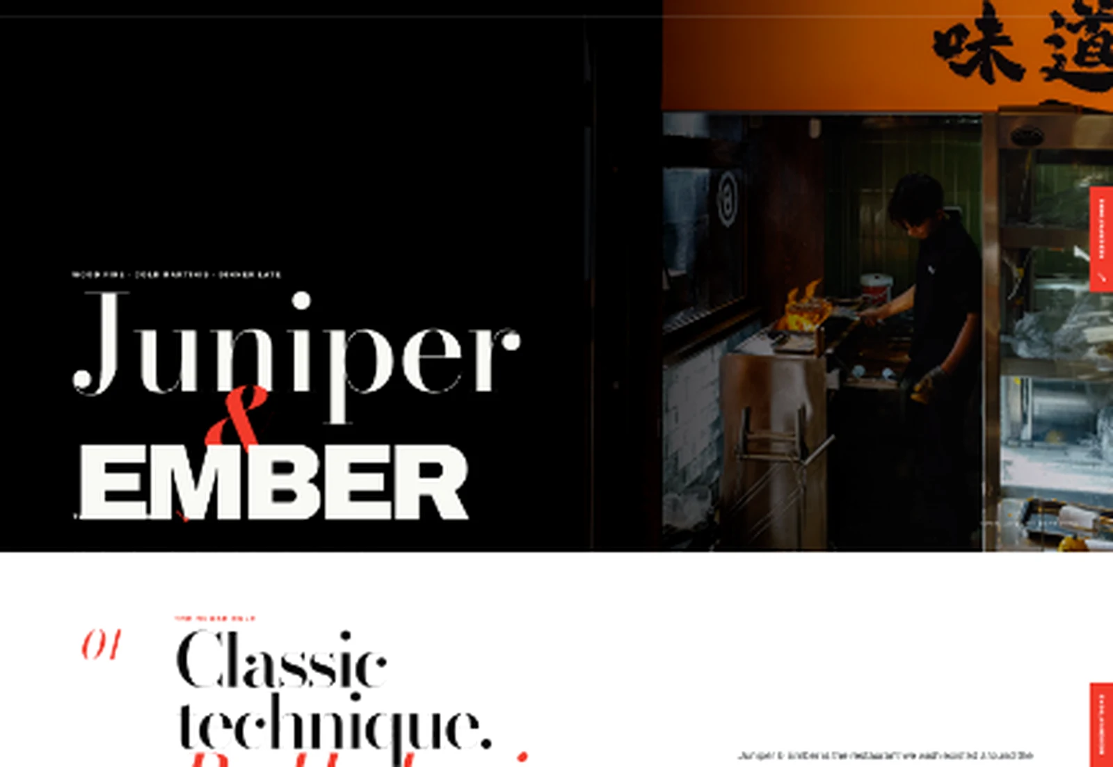
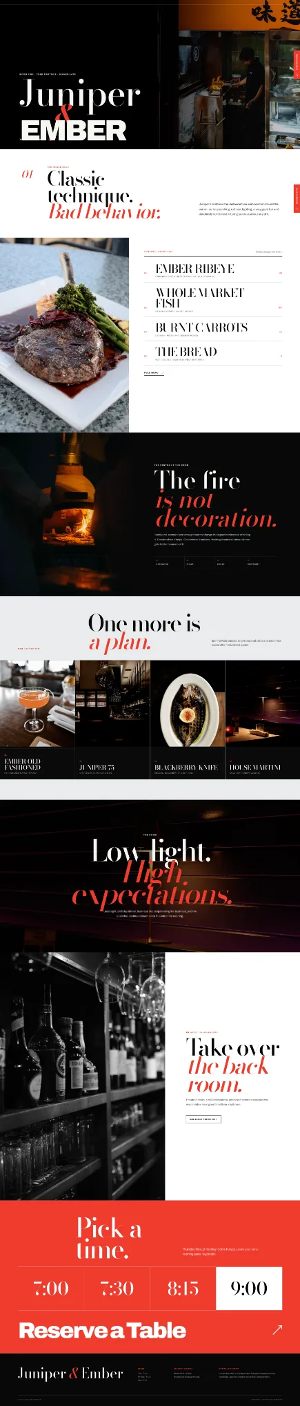
Classic typography meets modern brutality: Bodoni-style editorial serif, clean utility sans, black and stark white, electric vermilion and steel. The layout behaves more like a fashion spread than a template, using oversized menu typography, full-bleed fire photography and a horizontal cocktail rail.
A deliberately polar-opposite hospitality experience with a strong point of view, clear reservation path and enough identity to extend naturally into menus, signage, social campaigns and private-dining collateral.
CAPABILITIES
FULL EXPERIENCE
Each concept was built as a functioning responsive website first, then documented as a case study from the finished product.
Choose which optional cookies may be used. Necessary cookies are always enabled so the site can work securely.